
Why negative space is such a positive design technique.
Negative space is a powerful bit of nothingness surrounding by other visual stuff and when masterfully combined, can create layers and dimensions that can really bring a logo to life. At its best negative space can give a logo an optical illusion effect that can make you want to linger on it. It’s like you’re seeing two things at once.
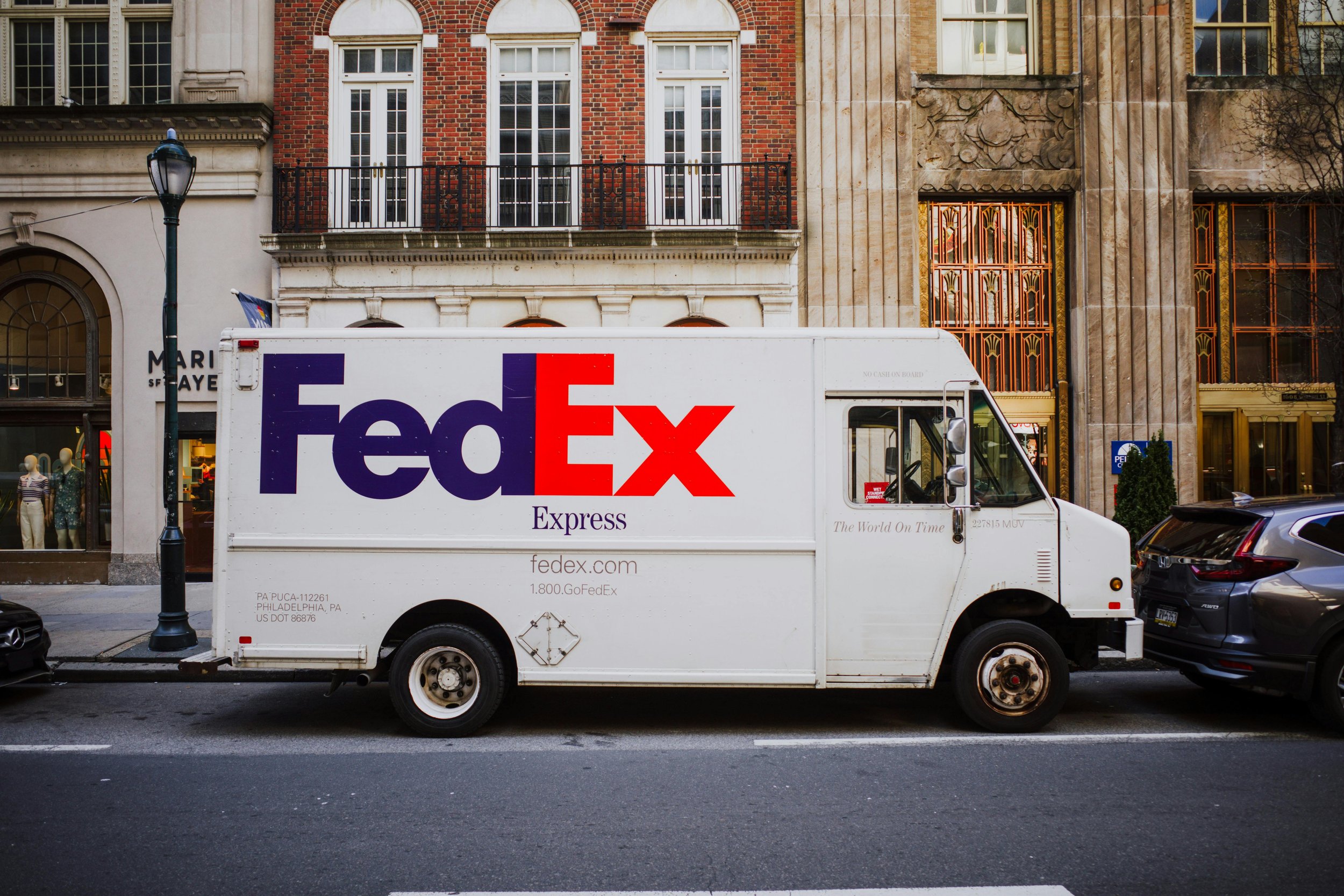
One of the most famous examples of the use of negative space in a logo is the arrow in the “hidden” in FedEx. Once you see it you can’t not.
I find it amazing how even the tiniest morsel of negative space can create a full picture and bring shapes to life. NBC is one of my favourites.
Back in the 1960s when TV was turning colour, NBC chose a peacock, a symbol they still use today. (Here’s an interesting look at the history of the NBC identity over the years. The first peacock was designed by Herb Lubalin a leading American designer in the mid twentieth century. The guy’s got his own very famous typeface and it’s a beauty)
But I digress.
Ahh the NBC peacock. All it is is 6 identical shapes. That’s it. But look at that little almost insignificant notch that implies the beak. BOOM. You got a bird.
One of the best.
The illustrator Noma Bar is one of the most skillful designers when it comes to negative space. His powerful, often politically charged illustrations explore contemporary issues often using the contrasting elements as opposing forces. Here are a few of his illustrations.


His work is not purely negative space, he combines elements as well, as seen in these characters of Spock, Sam Jackson/John Travolta, Spielberg, Trump.
Finally, here are a few negative space logos I admire…


