
Why composition matters.
At its best, the proper composition of any piece of design is invisible.
Good composition reveals information to the viewer in the optimal order so that they take in the information bit by bit.
It can be an almost instantaneous process, occurring to the reader in milliseconds, but make no mistake, the reason the designer fights the client when they tell them to make the logo bigger, is because the designer has balanced everything: the tone (light vs dark elements), the surrounding space, the shapes, the position of all elements, so that you arrive at the logo in due time.
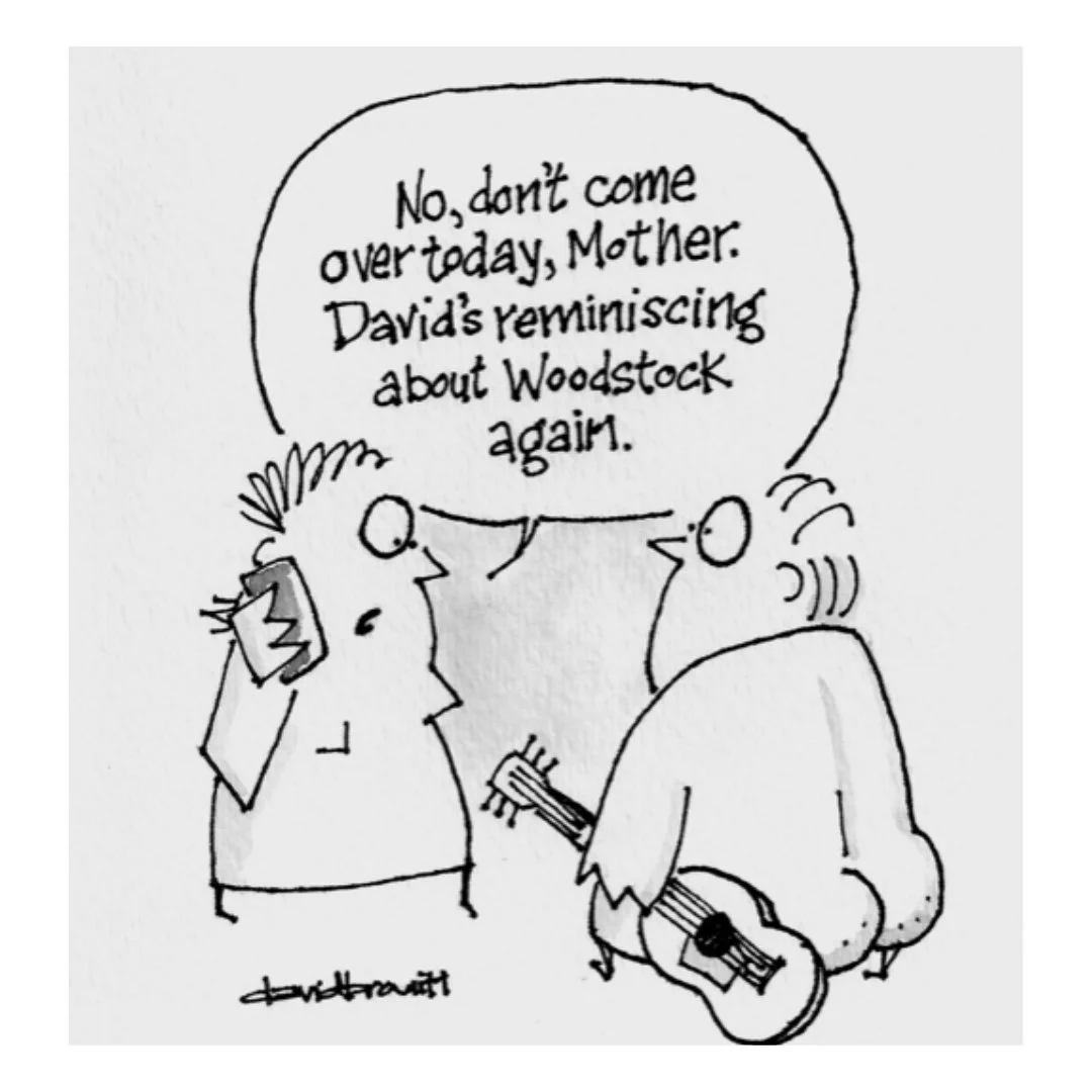
Here’s an example of how I apply it to cartoons.
This is the um… raw cartoon. Now let’s look at some of the design and composition decisions that went into it…
The phone acts as a starting point. It’s dark. It draws your eye in. Because it’s a cartoon, the next thing we’re going to want to know is what’s being said. So our eye naturally moves from the phone to the beginning of the words…

We then read all the words and end up at the bottom of the speech bubble…

Because we’ve just been reading left to right, we then focus our attention on her eye…

And finally we arrive at the punchline. David’s bum explains the entire joke (and I wish I had a nickel for every time I’ve heard that). There are 2 pieces of direction at play here. Both the direction of her glance AND the neck of the guitar serve to funnel our attention to the wise crack…
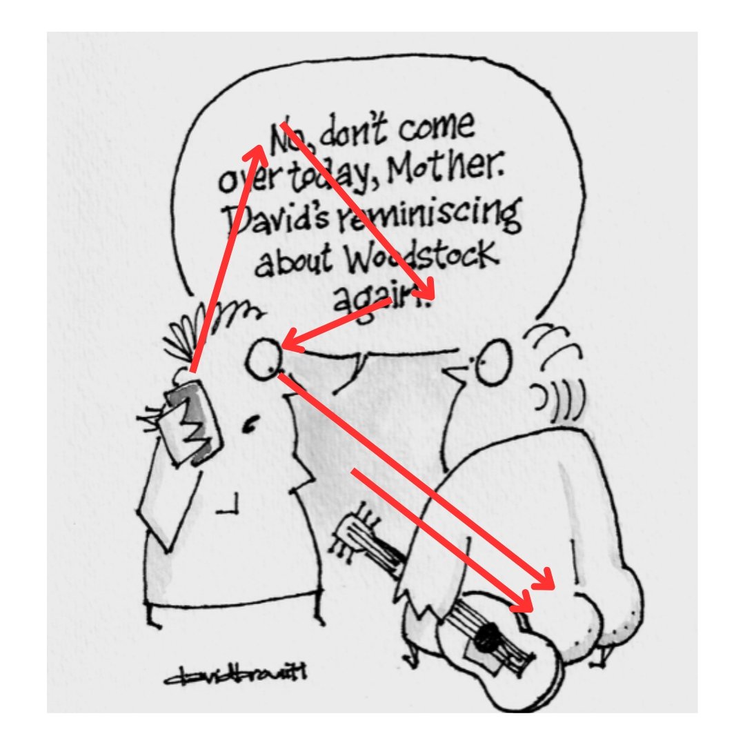
And that’s it! Like I said, this happens in a millisecond and no one looking at the cartoon is analyzing it this way.
But it’s real.
It’s why accomplished designers should be trusted, but it’s also why they should always be able to explain why the logo is precisely the right size after all.